Weighing Stars is Difficult
The old OkCupid controversy may be explained by poor calibration.

Introduction
This post is a response to Poitr Pachota's essay "The average is not 5". I refer to some very specific details, so I recommend opening it in a separate tab to follow along.
I appreciate Poitr’s points about measures of central tendency, and his skill-based explanation for the skewed ratings is very interesting. Although his interpretation of the results from OkCupid is elegant, I think that OkCupid’s data is too poorly calibrated to draw conclusions from, and my (admittedly amateur) attempts to resolve the ambiguity either bolster this agnosticism or indicate a problem with women’s dating preferences.
Calibrating a Five-Point Scale
I suspect that much of men’s disdain for the opinions expressed in the OkCupid study are based on a reasonable (though perhaps incorrect) interpretation of its “five-star” scale of attractiveness. To see why, consider the more-common ten-point scale. I think that most people calibrate it similarly to the Starter Pack meme in Poitr’s article (1: grotesque; 10 stunning). Ratings above 5 indicate attraction, and ratings below 5 indicate repulsion.
This jogs the question: how do people calibrate the five-point scale? An obvious method is to compress the ten-point scale:
1-2 (of 10) (Grotesque or Hideous) → 1 (of 5)
3-4 (Ugly or Homely) → 2
5-6 (Plain or Cute) → 3
7-8 (Pretty or Beautiful) → 4
9-10 (Gorgeous or Stunning) → 5
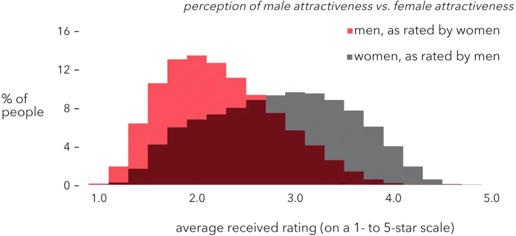
In that case, women rate the dating market's modal man (2.0) as mildly repulsive ("ugly" or "homely"), and even the best fraction of a percent of men (4.0) are merely "beautiful" (or whatever the gender-mirrored term is). If that accurately represents women's opinions, then men are justified to feel insulted and frustrated.1
Of course, the scale could be calibrated differently. For example, perhaps it's Winsorized instead of compressed:
1-3 (Ugly or worse) → 1
4 (Homely) → 2
5 (Plain) → 3
6 (Cute) → 4
7-10 (Pretty or better) → 5
If that was the case, then women would still rate an overwhelming portion of men as neutral or repulsive.
Okay, perhaps because the purpose of dating apps is to match people with those who they’re attracted to, anything short of an attractive profile is lumped together as a failure and given the minimum rating. In other words, participants only considered the positive half of the scale, so 1 is no attraction (repulsion or neutrality) and 2-5 is outright attraction. Then, the conversion would be something like:
1-5 (Plain or worse) → 1
6 (Cute) → 2
7 (Pretty) → 3
8 (Beautiful) → 4
9-10 (Gorgeous or better) → 5
...but this has the opposite problem. The results, in which nearly all men are rated significantly higher than 1.0, would imply that almost all male daters are attractive, which is obviously false.
We could probably gerrymander the scale to get "reasonable" results for what women think of men—but that would still serve my point. We would be embedding our assumptions about women’s opinions into our data, so using the data to draw conclusions about women’s opinions would be circular reasoning.
To solve this problem, we need a logically independent source of calibration. I don’t have access to the participants in OkCupid’s study, but my wife is only 30 feet away!
Case Study
Without informing my wife about my essay, Poitr’s essay, or the OkCupid study, I asked her to label a five-point scale for a dating app. Her exact, spur-of-the-moment answer was:
5: Excellent
4: Good
3: Average
2: Below-average
1: Outright unattractive
This answer is interesting for a few reasons:
It mixes absolute ratings, such as "good" and "outright unattractive", with relative/statistical ratings, such as "average" and "below average".
It logically implies that the average dating man is worse-than-good-looking.
If the women on OkCupid calibrated the scale similarly, then the actual average man (2.3) would be considered significantly below “average".2
Despite the obvious limitations of this approach, I think it demonstrates my point that either there are critical measurement problems with the five-point scale, or most women’s dating preferences are unreasonable.
Mixing Measurements
Piotr briefly addresses calibration in the section “What do the 1-10 ratings even mean?”. He rejects a percentile-based, relative calibration of the scale. Although other relative scales are concieveable, the most intuitive alternative is an absolute scale in which the qualitative difference in attractiveness between (e.g.) a 5 and a 6 is as large as the difference between a 9 and a 10, regardless of how many people are in each category. Poitr doesn’t explicitly endorse this, but I think this is what he was going for—and I, myself believe it’s the most useful way to think about attractiveness.
The problem with this ideal, as my wife demonstrates, is that the way people think about attractiveness ratings in practice probably isn’t clean-cut; as I noted above, it mixes absolute ratings with relative ratings.
I’m not basing this conclusion entirely on my wife’s response. Piotr documents several cases of people assuming that the average is 5-of-10 or 3-of-5. This could be due to ignorance of statistics, as he suggests, or it could be due to conflation, in which people switch between thinking in terms of absolute and relative scales without realizing it.
I think our next question should be: is this intentional? When relative and absolute terms are used on the same scale, can we draw valid concrete, statistical inferences about raters’ preferences? If most women rate “average” as worse than “good”, would it constitute a deliberate judgement about the average man, or is that juxtaposition simply a product of muddled thinking? If women were given the opportunity to revise their labels, would they eliminate the relative labels, eliminate the absolute labels, or keep both? If they choose to revise their labels, then would the distribution of ratings change, too?
If the answer is “yes, ordering Average below Good is intentional”, then we’re left with the conclusion that many women think discouragingly little of the average man, regardless of whether that’s defined in terms of mean, median, or mode.
On the other hand, if the answer is “no, let’s not mix systems”, then we should ask ourselves whether whatever we’re measuring right now, given that we are mixing systems, is stable enough to be meaningful, let alone useful.
Of course, it’s possible (if not probable) that other women calibrate the scale quite differently from my wife, but a scale that’s very inconsistent between raters isn’t much more useful than one that’s inconsistent with the same rater over time.
Averages Must be Average
Piotr rightly notes that most men may be below-average in attractiveness. After all, the median is not the mean. However, I think this argument sidesteps many people’s actual concern: for any given measure of central tendency, perhaps women rate a statistically average man significantly “below average”.
This concern has some psychological precedent. It’s well-known that most people consider themselves to be better-than-average as drivers and in lots of other ways. Additionally, there’s some evidence that people perceive neutral luck as bad luck. For example, even when a computer game is rigged in the players’ favor, many players still complain that the game is rigged against them.
It’s easy to see how these biases, or related biases, could lead people to believe that they’re being presented with below-average dating partners and, consequently, rate the average dating partner as below-average. Superficially, the combination of OkCupid’s data and my wife’s rating system supports this conclusion; although she labeled 3 as “average”, in no sense is it near the true average rating of 2.0-2.3.
However, as I wrote above, we can’t reach reliable, concrete conclusions based on one rater’s labels, because other raters might calibrate the scale much differently. Once again, we’re forced to choose between concluding that the data indicates that women’s preferences are unreasonable or that the data isn’t consistent enough to be meaningful.
Gender Differences
This is the primary reason I haven’t addressed the gendered difference between the distributions before now. I think there’s a large probability that we think we’re reading minds, but we’re actually reading palms—in other words, that the data simply aren’t valid measurements.
Perhaps the difference between distributions is due to greater shame on unattractive women, as Poitr theorizes. Perhaps it’s due to women being pickier for evo-psych reasons,3 as some others theorize. I’m positing a third theory: perhaps men and women calibrate the ratings differently. In other words, perhaps a man’s “3” is different from a woman’s “3”.
For example, perhaps men tend to calibrate in relative terms, whereas women tend to calibrate in absolute terms. Perhaps women tend to zero the scale at “mildly ugly”, and men zero it at “extremely ugly”. Perhaps women tend to compress the 10-point scale, but men Winsorize it or don’t think in terms of the 10-point scale at all. Perhaps men’s and women’s calibraions would be similar upon reflection, yet differ considerably off the tops of their heads. I could go on.
There might be subtle ways to discriminate between these hypotheses, even if the data are mostly junk. If I’ve understood Piotr’s argument correctly, then for theoretical reasons:
Men’s attractiveness distribution is lengthened on the right.
Women’s attractiveness distribution is lengthened on the right and shortened on the left.
In other words, women’s distribution should be less dispersed.
Even from a brief glance at the histogram, the opposite is clearly true; women’s attractiveness is more dispersed.
As far as I can tell, any plausible explanation of this discrepancy—that is, explaining why these two distributions have switched widths—would imply that they use different scales.4 If so, then the general phenomenon of gender-based differences in calibration would logically follow from Piotr’s analysis. His theory might still be true, but it seems superfluous.
Conclusion
Ultimately, the only way to reliably answer the question of how men and women quantify attractiveness would be with a large, controlled experiment. Until then, I think that everyone from researchers to lonely men should be extremely hesitant to draw any concrete conclusions from the OkCupid study—or from any uncalibrated data, for that matter.
Among the entire population, perhaps the average man is unattractive, but the men on dating apps are disproportionately attractive. Most of them are young, so they aren’t overweight or balding (yet). Also, due to socioeconomic factors, the most unattractive men aren’t on dating apps. (e.g. a man who’s homeless because of a meth addiction) Third, because they’re on a dating app, they’re at least nominally motivated to be attractive.
EDIT: This line originally said “significantly ‘below average’”. A commenter rightly criticized this phrasing.
I wish that Piotr addressed this theory in his post. As an armchair psychologist who follows dating discourse, he’s almost certainly heard of it.
It’s conceivable that one sex’s appearance has objectively less variation. (Consider what the distributions would look like if all men were genetically identical.) However, this explanation feels very ad hoc, and it would be quite surprising if the other sex’s tastes did not adjust to become more sensitive to the differences.
Every time I see any discourse about this OK Cupid graph I always think that the correct comparison shouldn't be how men rate women vs how women rate men, it should be how do women vs gay men rate men, and how do men vs gay women rate women. It seems obvious to me that women's average would be higher on the scale, since as Poitr points out women in general spend much more time working to improve their rating (and also have access to an easier socially acceptable way to do so in makeup)
“If the women on OkCupid calibrated the scale similarly, then the actual average man (2.3) would be considered significantly ‘below average’.”
Uh, sorry, no.
Based on your wife’s defined scale, where 3 is Average and 2 is Below Average, then the 2.3 score indicates that the average man is something above “Below Average” though not all the way to “Average”.
The word “significantly” here is inaccurate. And given your use of quotes around “below average” there is no doubt that it is inaccurate.
Remove the word “significantly” and you have a fully accurate statement, one that matches with the data and with your wife’s scale.